Clarity is a
form of care.
A new medical-information brand needed a professional identity before it could launch. We built the whole system - so the founder could focus on the message, not the look.

A real idea with
nothing to stand on.
The founder of Clinically Clear had a clear mission: translate complex medical research into information people can actually use. What she did not have was a brand. No identity, no consistent voice, no assets to build a digital presence around.
In a category where trust is everything, launching without a professional identity is a non-starter. Medical information has to look as credible as it is accurate - warm enough to approach, authoritative enough to believe.
The job: give her a complete, launch-ready identity to build everything else on.
A full identity system,
not just a logo.
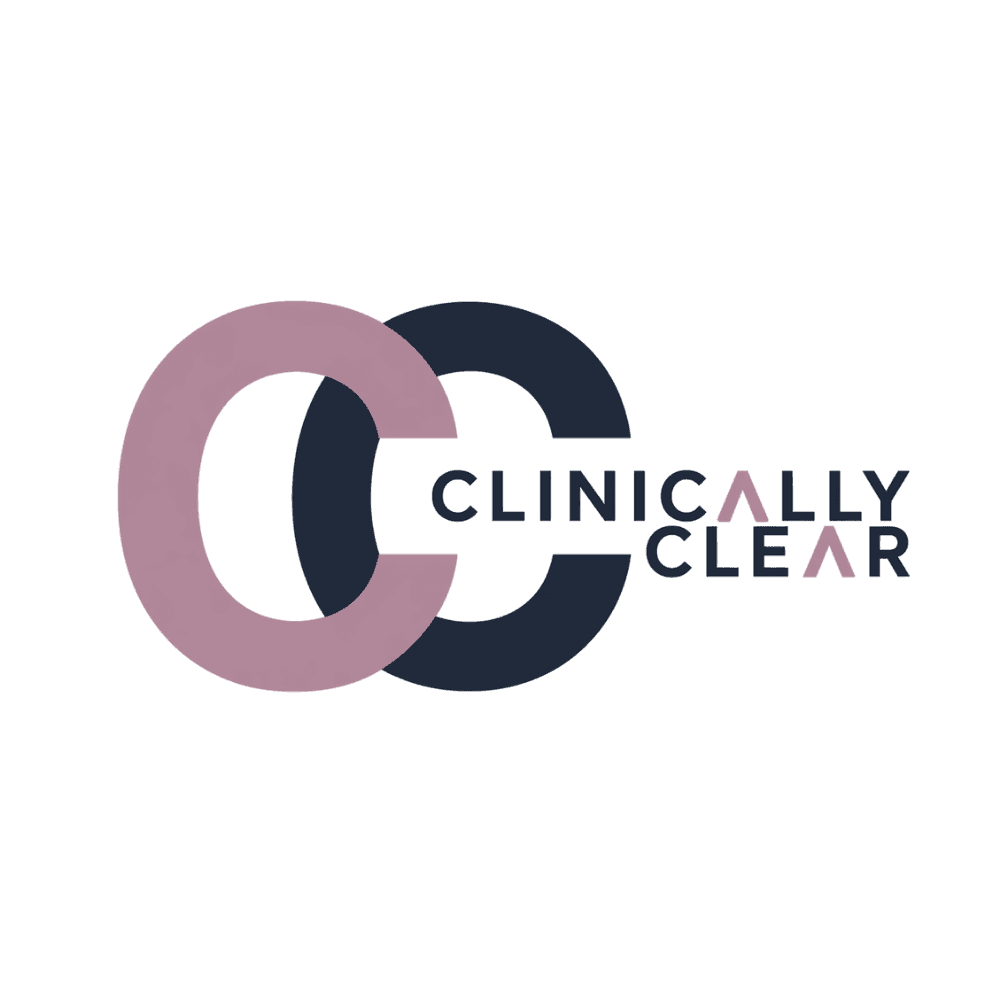
Two C’s. Warmth
and authority.
The mark is built from two interlocking C letterforms - Mauve on the left, Deep Slate on the right. Where they overlap, the brand voice lives. The crossbar-less, mauve “A” in the wordmark is the signature detail.
Five colors.
Extracted, not chosen.
Every value is pulled straight from the official logo files and locked. Deviation needs brand approval.
Three faces.
One job each.
simply told.
A new study of 2,847 adults found that reading medical information in long, dense paragraphs significantly increased reader anxiety compared to structured, clearly formatted text - even when the content was identical.
RR 0.72 · 95% CI [0.64, 0.81]
p < 0.001 · NEJM 2024 · n = 2,847
Warm, but never
soft on facts.
Every claim is cited. Every uncertainty is named. We do not simplify by omitting - we simplify by explaining.
The tone does not change based on how scary the topic is. Calm is not dismissive - it is the most respectful thing we can offer.
Short sentences. Jargon translated the moment it appears. Like a smart doctor texting a friend - not dumbed down, just human.
A brand she can build on.
Clinically Clear launched with a complete, professional identity - a logo system, a locked palette, a typographic hierarchy, and a documented voice. Every future asset, from a TikTok caption to a newsletter, now has a system to follow. Partner Arc Affiliates built the site on top of it.